Role
User Research
Product Strategy
UI Design
Interaction Design
Usability Testing
Tools
Figjam
Notion
Maze
Figma
Dovetail
Timeline
5 weeks
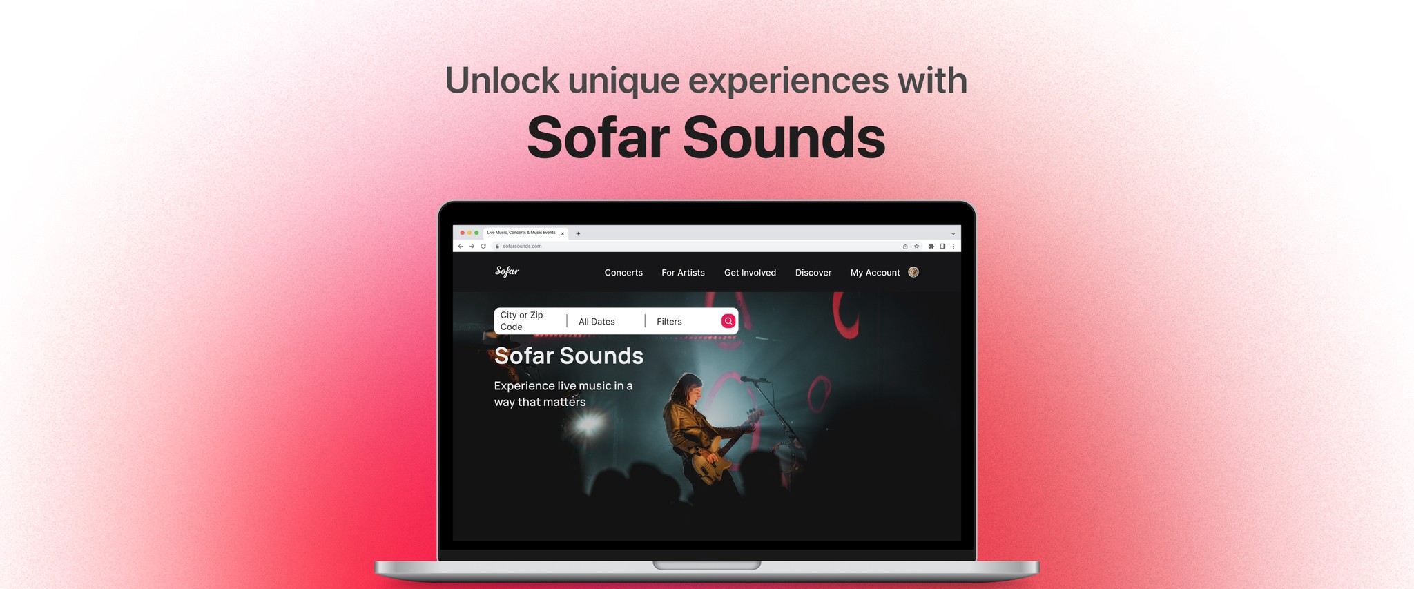
The Problem
Currently, the search bar is very limited with a single dropdown menu, only showing the nearby cities and the most visited cities. For this project, my team and I only focused on improving the search experience.
The Solution
We did some research and looked at different websites with search bars and we noticed that they focus on important segments such as location, dates, and certain filters if applicable. If our search bar could focus on those segments, the user won’t feel limited to just choosing a nearby or popular city.
Usability Review
We analyzed Sofar’s website and started to identify their pain points and wow moments that they currently have. We liked how they automatically finds concerts near you based on location services on your browser and the dates are organized by upcoming concerts. We noticed that the user could search based off location only, which really limited.
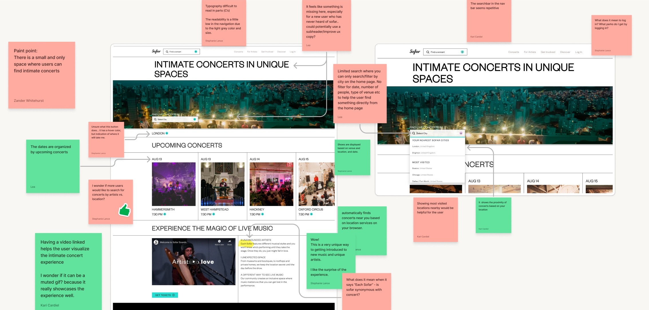
Business & User frustrations
Since the search bar is limited, only allowing users to search concerts nearby or in popular cities, it can cause frustrations and disappointments. What if the user wants to search for a particular city that is not nearby nor popular? It could be challenging and that could negatively impact the business. We realized that if we allow the user to customize their search in an easy way it would make the experience more efficient and would align with the business goal of increasing the bookings.
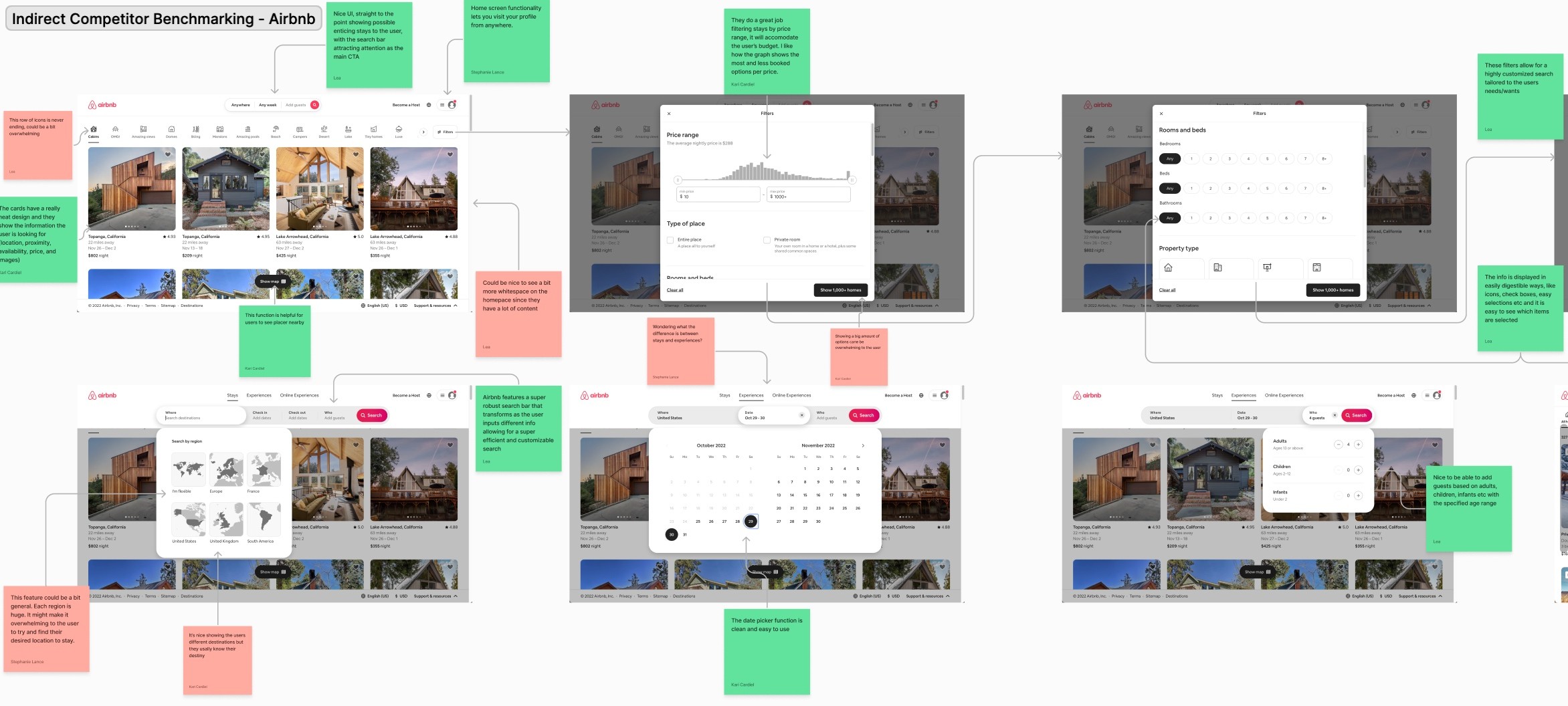
Competitor Benchmarking
We continued our research by identifying direct and indirect competitors and we investigated their UI, user flows, and most importantly their search features. This process inspires me and helps me notice how to improve a product.
Our direct competitors were Songkick, Ticketmaster, and Jambase; Airbnb was our indirect competitor. Our direct competitors had a sophisticated search bar where the user can input their zip code, dates, artists, venues, or events. That way, it gives more options to show the user and what they are looking for. In the other hand, Airbnb has sections in their search bar where the user can search by destination, dates to check in and check out, and number of guests. In my option, those search bars gives freedom to the user and can improves the search experience.
Below is an example of the usability review for Airbnb.
User Research
After completing our competitor benchmarking, we jump straight into our user research to gain more understanding on what the users expect when they book live experiences. We interviewed individuals that enjoy concerts and we asked them basic demographic questions, their experiences and expectations booking concerts, their challenges while doing so, their process, and more. This process helped us to get a better understanding of the user’s needs.
Interview Highlights
We used Dovetail to analyze our interviews and to highlight useful nuggets for our product. We quickly found common themes and we created four categories to group our highlights: habits, behaviors, needs and expectations, and frustrations. Then, we created an affinity map in Figjam to get a clear visual of our findings.
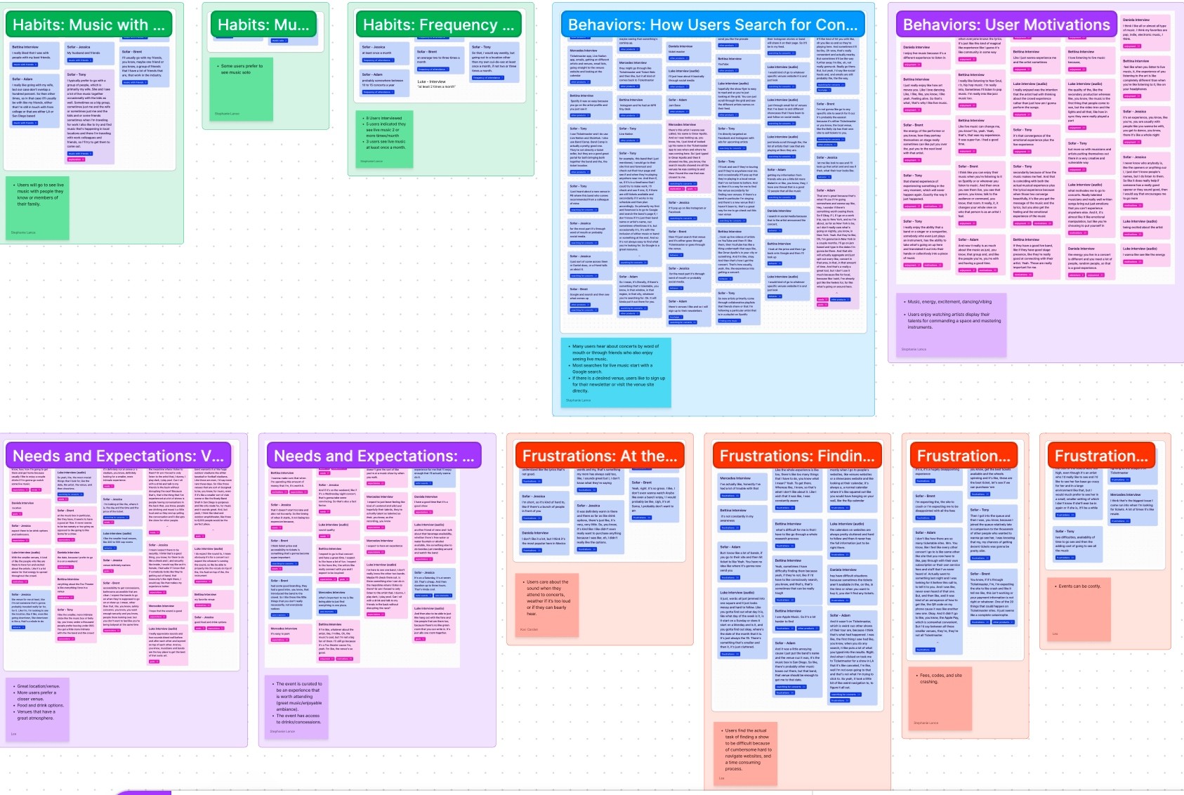
Primary Insight
Users find the task of searching for a concert to be difficult and time consuming
Secondary Insight
Users care about specific details like location, proximity, venue type, atmosphere, amenities, and price.
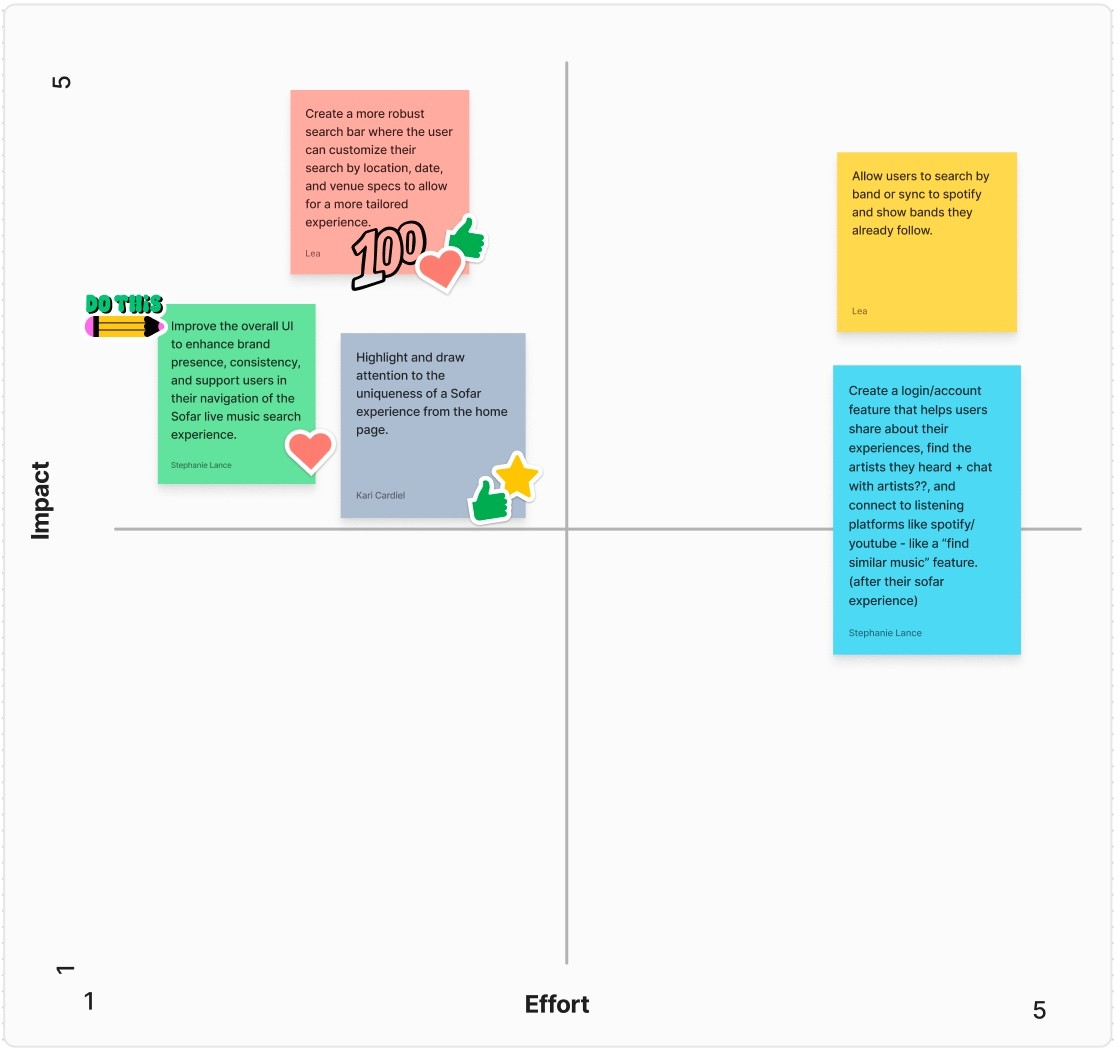
Priority Matrix
We brainstormed ideas and plotted our main ones on a priority matrix and considered important and realistic aspects such as project time constrains, effort needed, and the impact it would have on the user and the business. This was a helpful process because we were able to focus on the high importance and low effort. We decided to create a robust search bar for a more tailored experience, improver their overall UI to enhance brand presence and consistency, and highlight the uniqueness of Sofar.
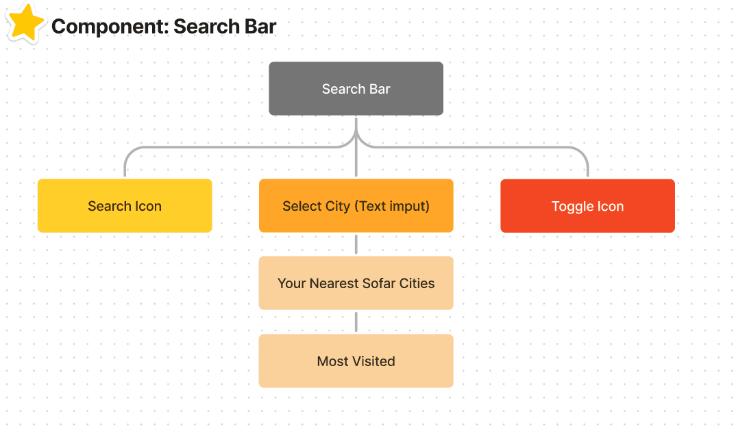
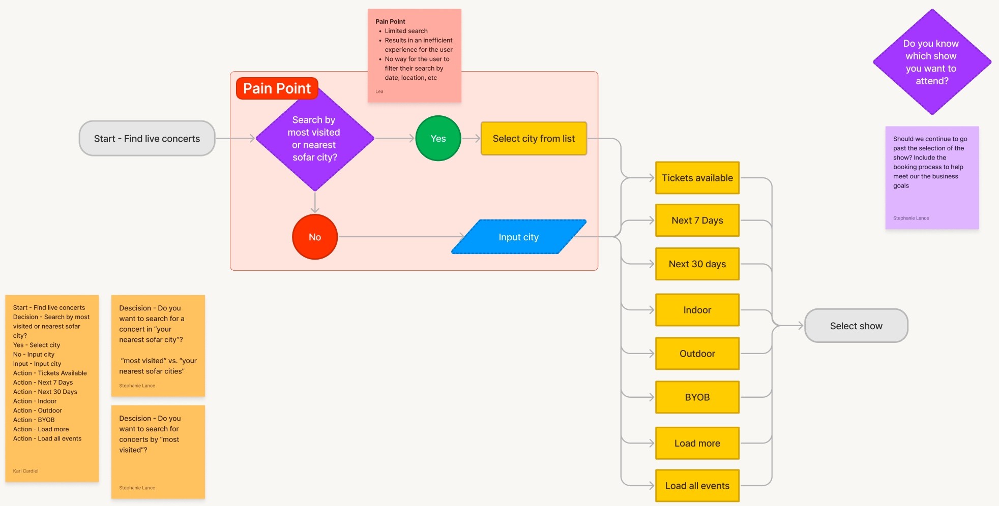
Information Architecture
To analyze the current flow, we created the current information architecture for the search bar.
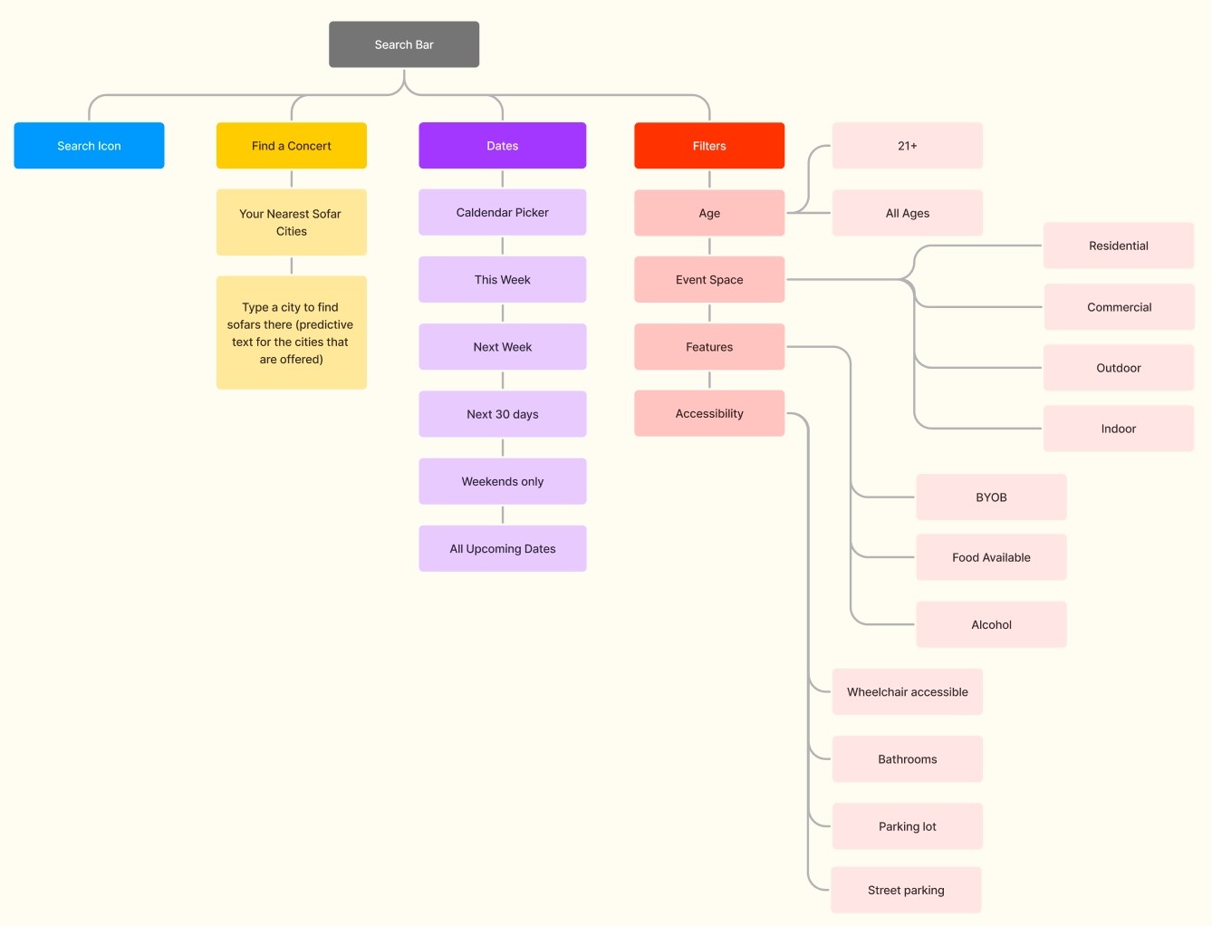
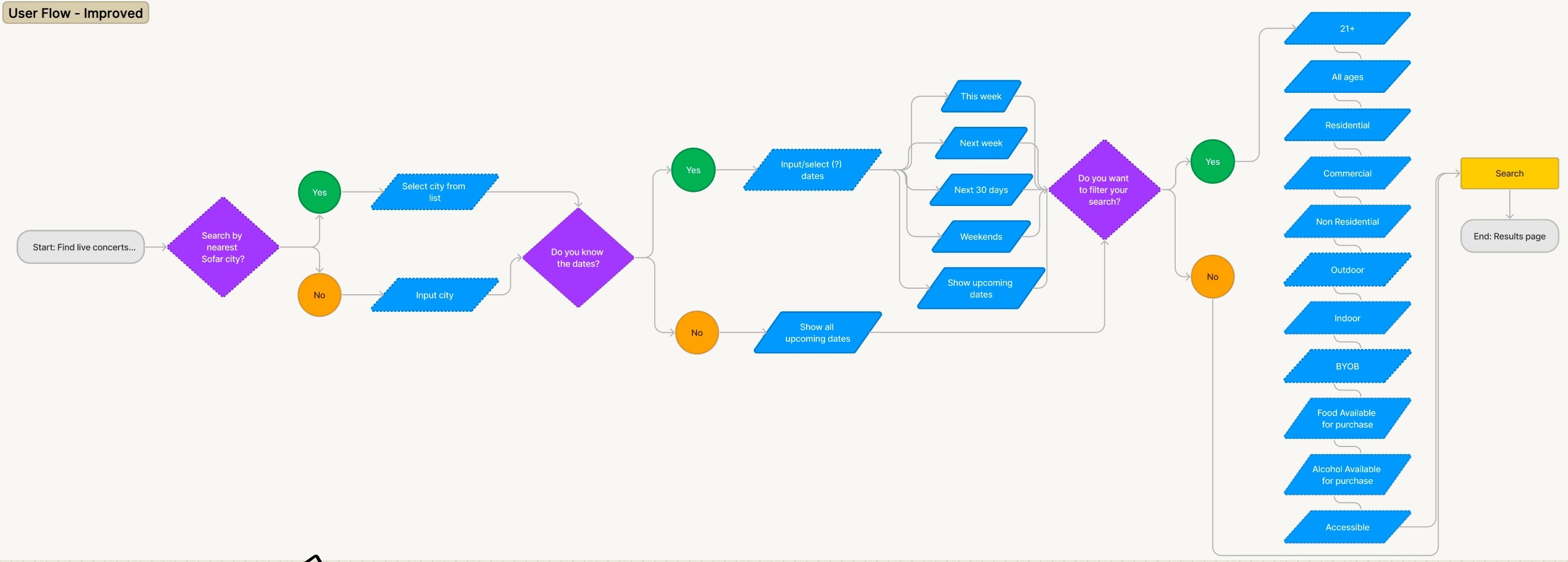
We pinpointed where we wanted to improve the experience, so we developed the new information architecture for this particular component, making it a customizable, efficient and tailored search experience.
User Flow
Currently, the user flow doesn’t give freedom to the user to filter their search. The only way to apply some filters is at the results page, however it still remains limited through few buttons.
Our new user flow portrays the options that the user will go through this new search experience. Once they have selected their city, they will be able to quickly select dates on a calendar with handy options such as: this week, next week, and weekends only. In addition, they will be able to apply filters on their search directly from the home page.
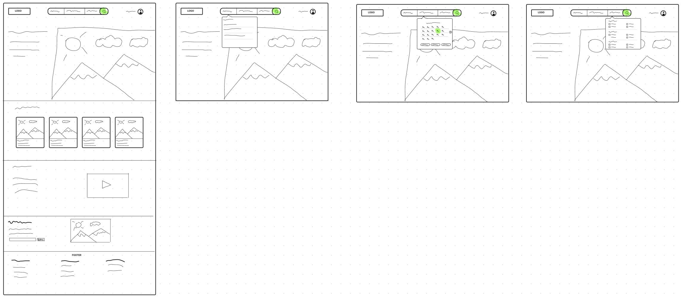
Wireframing
After brainstorming and sketching our crazy eights, we broke down what is most important in the search bar with atomic design.
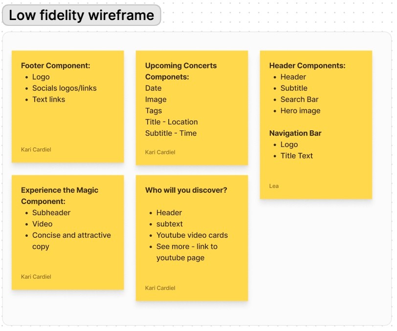
We found helpful creating sticky notes for each component with its specific atoms, it made easier the creation of the sections that we envision in our wireframes.
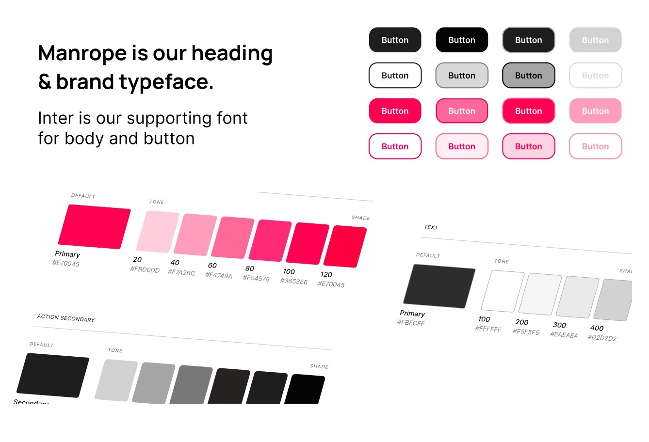
Styles & Components
During our usability audit, we noticed that Sofar has some inconsistencies throughout their website. We decided to simplify the color scheme and make the overall UI consistent.
High Fidelity Prototype
Click here to view our final prototype.
Usability Testing
Our working prototype was completed by 24 user on Maze, where users were asked to complete a series of tasks that measured our new user flow , in addition of an improved search experience and overall UI.
Test outcomes
We reviewed the test and few screens had lower usability scores. For example, in the calendar drop down, many users clicked on the calendar directly instead of the filter buttons. Our filters drop down, the users couldn’t see the “Apply filters” button without scrolling.
We also noticed some users clicked in and out of the drop downs multiple times before completing the task. The reason for this was not clear, we will plan to make some adjustments of location of buttons that will help users navigate the flow better.
Three key learnings
Knowing our audience was key. I think that our research interviews helped us a lot to gain more insight of the user’s needs and their expectations.
Break down to build up. I think it was really useful to break down the current user flow to find pain points and to make a better flow. Also, breaking down out components into atomic design was helpful to build up our final product.
Keep the uniqueness. We quickly noticed that Sofar is a unique platform, we wanted to keep their integrity intact.
Next steps
As designers, our next goals will include making iterations on the drop down elements of the search bar to increase visibility and accessibility, and improve the scrolling. We also want to focus on the troubleshoot of the flow to make sure the buttons are easily accessible.
We will be determining if our changes impact user positively and we’ll continue to make adjustment and iterations.
Once we’re done, we will conduct usability testing with more participants.