Role
User Research
Product Strategy
UI Design
Interaction Design
Usability Testing
Tools
Figjam
Notion
Maze
Figma
Timeline
5 weeks
The Problem
After analyzing the app and putting ourselves into the user’s shoes, we found that the interface has many options that overwhelms first-time users, making them unaware of where to tap to complete the cold shower challenge.
The Solution
After doing our research, we came up with a new design and new improvements in the interface, bringing the cold shower challenge to the user’s attention. Doing so, it would increase the chances to complete the challenge.
Usability Review
We analyzed the current flow and took screenshots to highlight the pain points and wow moments in the UX and UI. We noticed that the UI is inconsistent, lacks hierarchy, and has too many call to action (CTA) buttons. In the UX side, it is hard to understand the basic navigation functions, it is not efficient since it takes time to find the challenge, and the users make errors to get to the challenge.
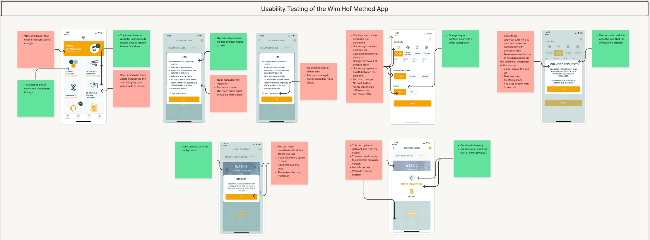
Business & User frustrations
Since the challenge is not visible, the user needs to make errors to find it and might feel overwhelmed, frustrated, and probably is not enjoying the experience. Currently the app offers 5 free days of the cold shower challenge, after that, the user needs to upgrade to the premium plan to continue with the challenges. If the product is not enjoyable to the user, the sales conversion rate decreases.
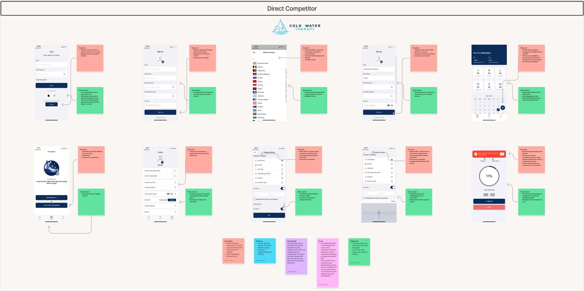
Competitor Benchmarking
This was one of my favorite processes in the UX research because it showed us what other companies are doing, and what is working and what is not.
The direct competitor apps that we analyzed were Cold Water Therapy and Breathwrk. Both apps were easier to use, had friendly designs, and tackled the user’s goals smoothly. We also analyzed Calm as an indirect competitor, the interface is so clean and it’s easy to navigate through the different products they offer. Below is an example of the usability review for Cold Water Therapy.
Problem Space
After the usability testing, we identified that first time users have difficulties with completing the challenge. We started thinking and brainstorming and we came up with different ideas on how might we address the problem. Suddenly, we noticed that more than one problem needed to be addressed.
How Might We…
How might we make it easier for first time users to complete the challenge?
How might we create a better experience for the user?
How might we help the user to identify the main challenge?
How might we make the user learn to navigate through the app quickly?
How might we encourage the user to keep doing the challenge?
Ideation
We had so many questions on how to make a better and enjoyable experience when completing the cold shower challenge. We created a mind map where we decided what to improve and what to add to the app.
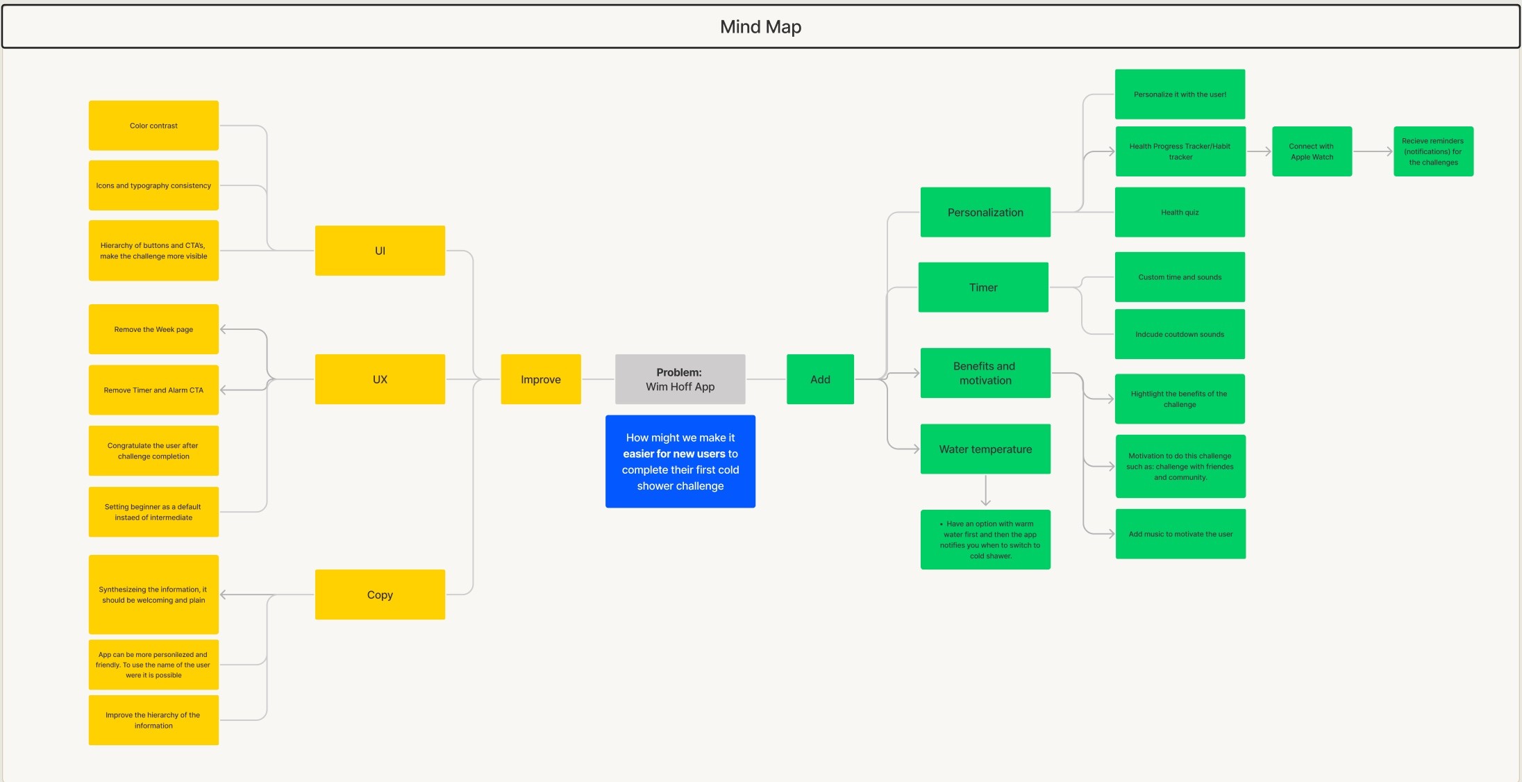
What can we add
We think if we could personalize the experience, add tips and benefits, create a timer for warm shower and a countdown timer to switch to cold shower, voice guidance. Adding those could make the experience better.
What can we improve
We identified that the UI, UX, and copy should improve. If we could make the interface consistent, the user flow easier and the copy simpler, it would benefit the user and the business.
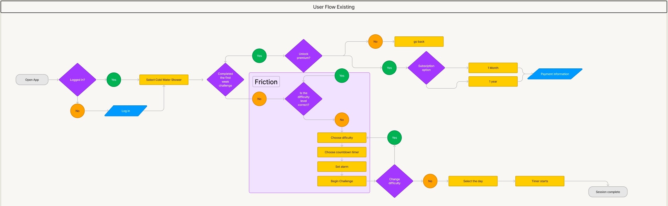
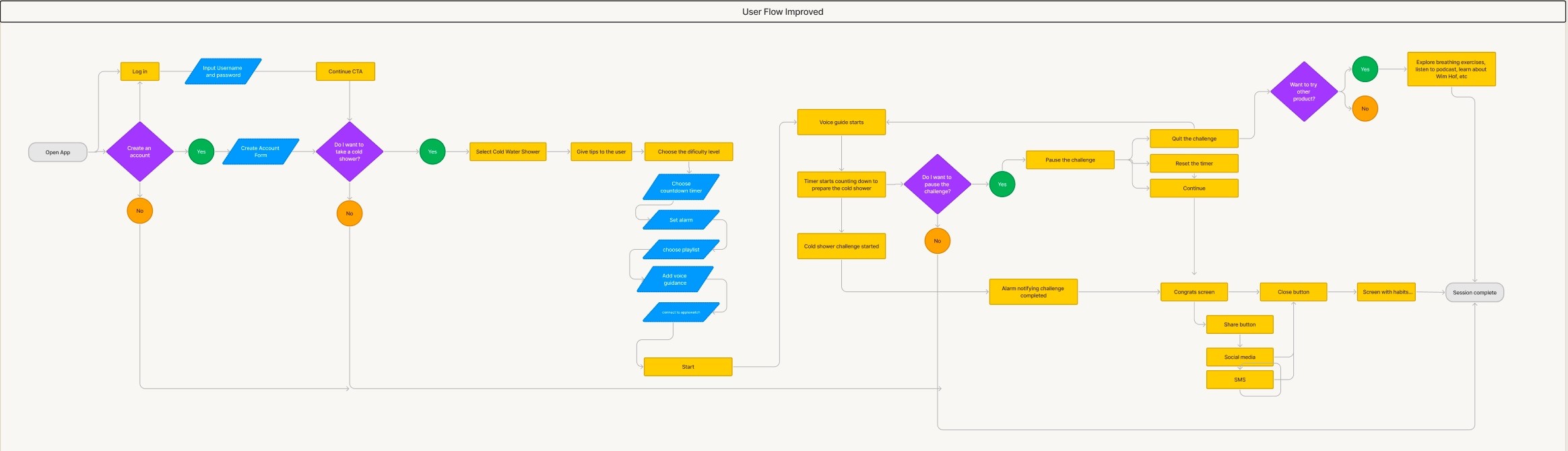
User Flows
We created a diagram where we identified the user’s decisions to reach the cold shower challenge.
When the user decides to do the challenge, there is a difficulty page where the user can personalize the challenge. However, we found some friction here since the user encounters too many CTAs and can feel frustrated. Once the difficulty level gets set, the user can proceed with the cold water challenge. We feel that it’s hard to set up the difficulty level page and the user skips the challenge.
To improve the current user flow, we decided to make the difficulty level page more user-friendly, giving the user tools to have a good experience while doing the challenge such as starting the challenge with different water temperatures, voice guidance, Apple Watch usage, and music from their favorite music streaming platform.
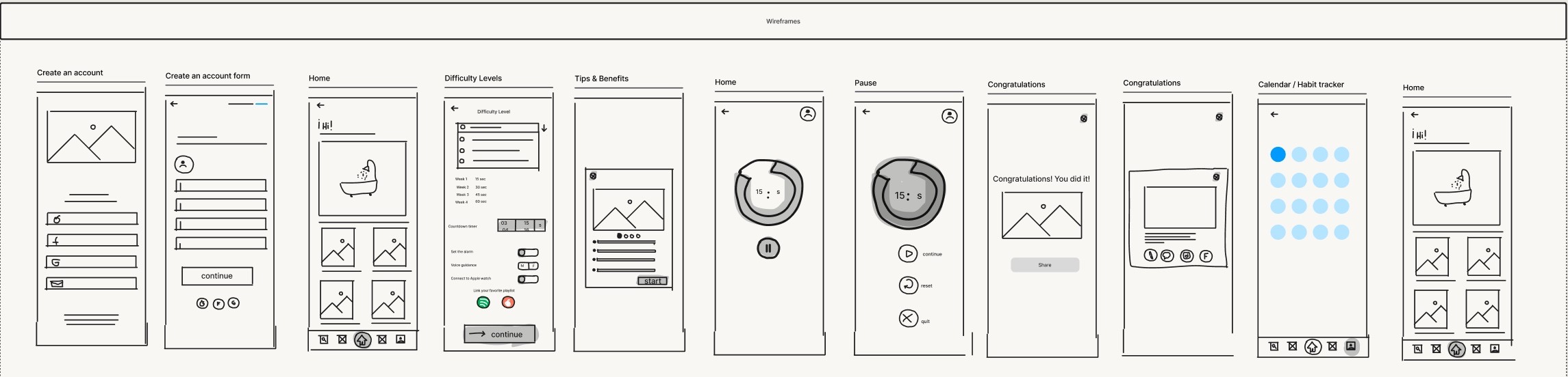
Wireframing
Wireframing was an important and fun step before our high-fidelity prototype because we focused on the many solutions to the main problem: making the first time user complete the cold shower challenge.
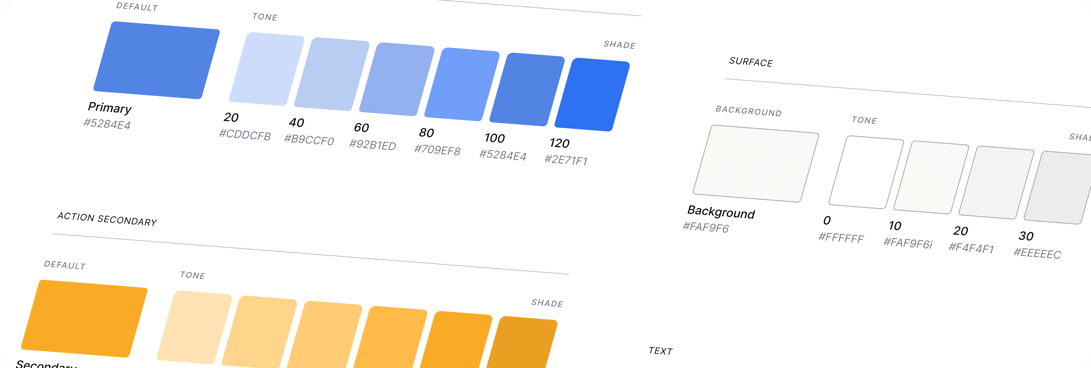
Styles & Components
We wanted to give a total transformation to the UI, including the main colors. We chose a deeper blue that symbolizes cold, relaxation, peace, and calm. The orange symbolizes energy, optimism, and positivity. We felt that the change of colors made the UI more appealing.
It was fun creating all our components such as buttons and their states, toggles, navigation bar, timer, and cards. We relayed on Auto Layout, it kept our components consistent, responsive, and organized!
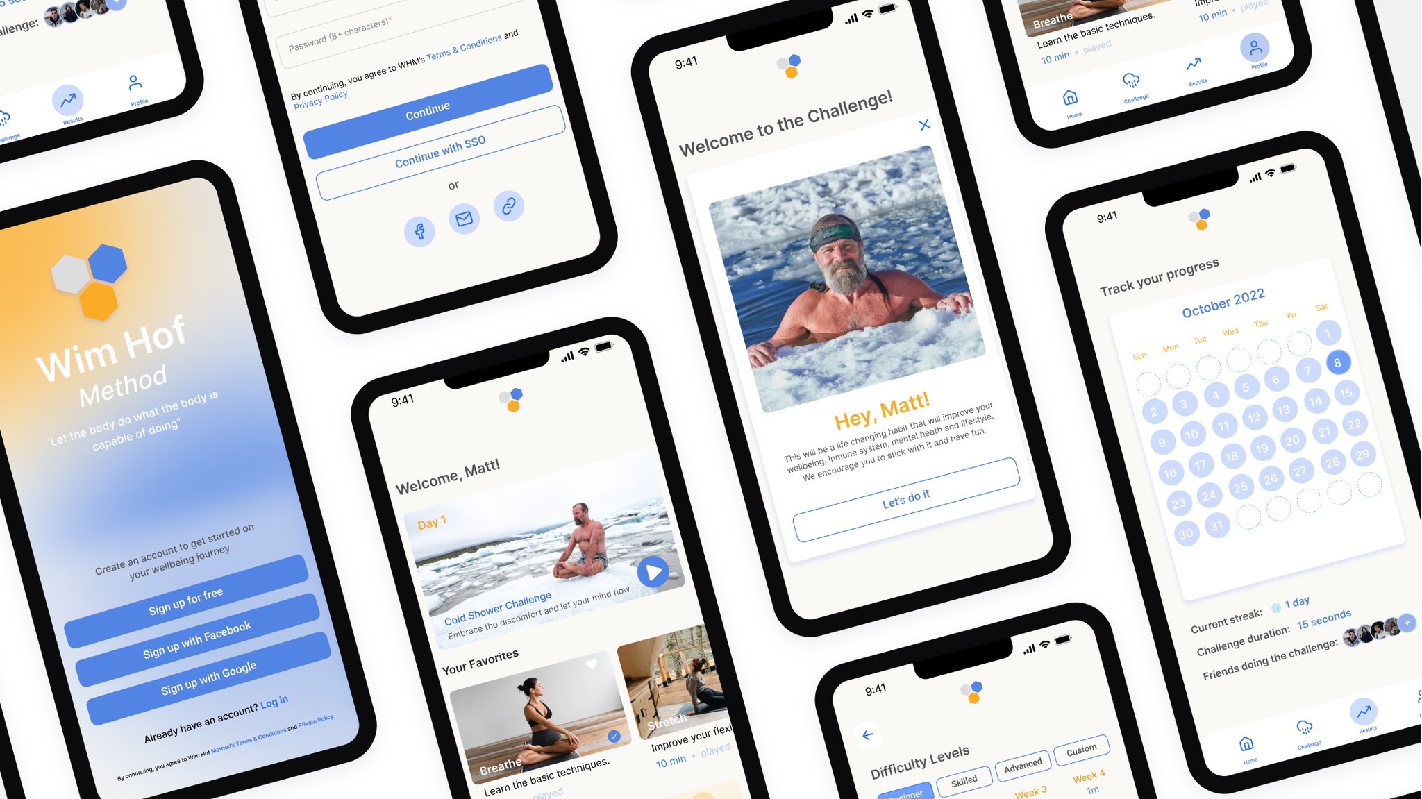
High Fidelity Prototype
Click here to view our final prototype.
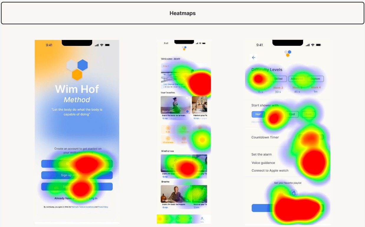
Usability Testing
We tested twelve users through Maze, giving them specific tasks such as missions, opinion scales, yes/no questions, and open questions. Once the test was completed, we analyzed the responses and the paths that the users took to reach the goal.
Test outcomes
The two missions were the following:
Enroll into the Wim Hof Method App
Complete their first cold shower challenge
With the help of heat maps, we saw that the first mission was accomplished, although some users preferred to enroll with third-party options (Google or Facebook).
For the second mission, we saw that users had different alternatives to access the cold shower challenge. Since we made the challenge more visible, we saw that users had easy access to the challenge. Also, we saw that they personalized the challenge, which made us really happy.
Three key learnings
Identifying the pain points and wow moments during the usability review and doing the competitor benchmarking was really helpful because it showed us what would need to be improved and what worked. It was also inspiring what our competitors were doing.
Keeping our UI components consistent and organized, made the prototyping process so smooth.
Ideation was key! We understood that the first idea we had might not be the best one and we kept brainstorming for more ideas until we found the right solution for our problems.
Next steps
There are some things we would adjust, such as the difficulty level page, making it easier for the user to use and understand. Following up with more usability testing, making better questions and missions for the user.